Conference

The central event of the Typographics festival is a con­fer­ence with speakers from around the world, focused on contemporary typography. It takes place Friday–Saturday, June 26-27, at The Cooper Union in New York City.

The main Typographics conference will feature an international line-up of designers, with presentations about type and its use in graphic design, web design, publication design, book design, packaging, branding, corporate identities, advertising, motion graphics, and more.

More speakers, talk descriptions, and other details will be posted here over the coming weeks. For updates and announce­ments, join the Typographics mailing list and follow Typographics on Mastodon and Instagram.

Get conference tickets

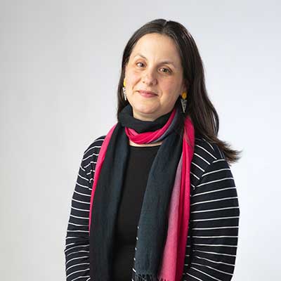
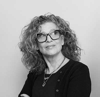
Corinne Ang

The Mythology of Legibility

In typography and design there is one infallible concept that we are taught to strive towards: legibility. Contemporary design seeks to create visuals that can speak universally, directly and efficiently to create that sense of legibility. The current definition of legibility ubiquitously used across the industry comes with the cost of losing visibility of something else. Every story has more than one side, through examination we will look at what legibility looks like from different perspectives and how this can impact the practice of design.

About Corinne Ang
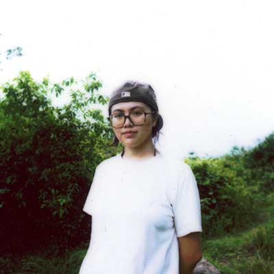
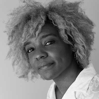
Corinne Ang

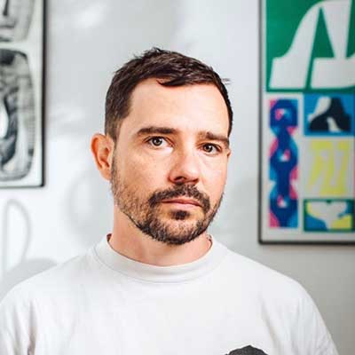
Corinne Ang is a graphic designer and type designer with practice centralising graphic form as a shared space for communities, memories and multiplicity. Originally from the Philippines and Hong Kong, she now works as an independent in Brooklyn. Her work varies across visual identity systems, typefaces & lettering, publications, illustration and web design. She has collaborated with likes of Carnegie Mellon University School of Architecture, Isometric Studio, OHno Type Co., Something Special Studios*, Studio Elana Schlenker, Sundae School, and Vogue amongst others. Alongside client projects, she independently designs typefaces guided by narrative, culture and formal play.
corinneang.com
@corinne_ang_

Kiel D.
Mutschelknaus

Instructions for Letters

What if the most expressive typography isn't drawn — it's written? This talk explores a practice built on generative systems that produce letterforms through parameters, rules, and controlled chance. Rather than designing type, the work designs tools for type: what transfers from traditional craft, what gets left behind, and what becomes newly possible when code is the hand. Drawing on the open-source Space Type Generator and broader client work, Kiel Mutschelknaus examines the instruction as the design method.

About Kiel D. Mutschelknaus
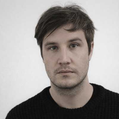
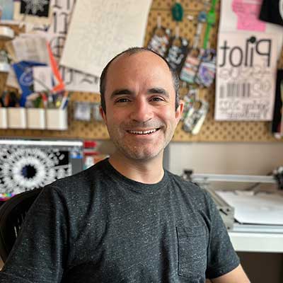
Kiel D. Mutschelknaus

Kiel D. Mutschelknaus is a motion and generative designer based in Maryland whose studio specializes in crafting computational tools for bespoke typography, image, and motion outputs. Working fluidly between code and creativity, he develops tools that empower designers to create unique, algorithmically-driven visual experiences.

His most notable project, Space Type Generator, is an open source tool widely adopted by the global creative community for kinetic type experiments. With 20 variations available, STG has been used for applications ranging from music videos and magazine covers to large-scale murals worldwide. The project has earned features in prestigious publications including It's Nice That, Eye magazine, étapes, and Novum magazine, with exhibitions in Hong Kong, New York, Taipei, and Seoul. Kiel has presented at renowned conferences including OFFF Barcelona, OFFF Tel Aviv, Us By Night, Tipografìa México, and INTL.

His client roster includes Nike, Google, Apple, Spotify, Netflix, YouTube, Adidas, and Bloomberg. Editorial work has appeared in the New York Times, Wall Street Journal, The New Yorker, MIT Technology Review, The Verge, and The Washington Post.

kielm.com
@kiel.d.m

Julien Priez

Analog thinking and digital tools

To become a type designer, you should find your own approach. At Estienne School in Paris, France, we studied calligraphy as a foundation for type design, imitating what we drew by hand on the screen. Since then, I have been walking on a bridge connecting these two disciplines, thinking on paper and drawing on the screen—not imitating one medium with the other, but using the different strengths of each set of tools available to me. I don’t do what I do by hand on the computer, and vice versa, but there is a strong structural, rather than visible, link between them. I will share my recipes and process for how I think with calligraphy to find ideas, structures and shapes for contemporary type design.

About Julien Priez
Julien Priez

Julien Priez was born in Montreuil, France, in 1986. As a child he dreamed of becoming an illustrator, toy designer, or math teacher, but he ended up studying graphic and type design at the Lycée Eugénie Cotton in Montreuil and later at the École Estienne in Paris, where he fell in love with calligraphy. In 2015 he joined the High on Type collective. The following year, the Morisawa Type Design Competition awarded Priez and Michel Derre its Bronze Prize in the Latin category for their Abelha script typeface. With the transdisciplinary design studio WeShouldDoItAll (WSDIA), in 2019 he painted fourteen murals at Nike’s World Headquarters in Beaverton, Oregon. In 2020, he and Yoann Minet created Boogy Brut, published by Bureau Brut. Priez designed Peugeot’s new custom typeface with Mathieu Réguer and Emmanuel Benoist in 2021. In 2023, the Centre du graphisme in Échirolles, France, mounted Priez’s solo exhibition The Boogy Show. In 2024, he joined Commercial Type for a new adventure.

@boogypaper@typo.social
@boogypaper

Amy Papaelias

Care and Complexity: Recipes for Alphabettes Soup

Pour fifty-five articles, interviews, essays, and twenty-six love letters by type practitioners into a 400-page book. Fold in a ten-year archive of 252 blog headers in twenty global scripts. Mix vigorously with 116 typefaces by women and gender-diverse designers from around the world. Marinate in editorial care and tantalizing typesetting. Sauté in hot feminist butter. Let simmer for two years. This is the story of Alphabettes Soup: Feminist Approaches to Type, a book that celebrates the Alphabettes network’s decade of typographic pot-banging and dis-organizing. Like community building, bookmaking requires complex recipes. From women’s typographical unions to printing trade clubs to radical publishing collectives, these messy histories teach us the secret ingredients necessary for cooking up the fiercest potlucks, through improvisation, imperfection, and intention. Step into the kitchen to see how the soup has always been made: together.

About Amy Papaelias
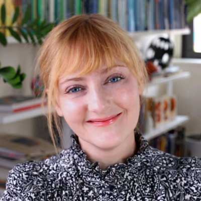
Amy Papaelias

Amy Papaelias is a type nerd, design educator, and one of the founding members of Alphabettes, a network supporting women and gender-diverse individuals in type and typography since 2015. She recently edited Alphabettes Soup: Feminist Approaches to Type (Bikini Books, 2026), a collection of essays and interviews featuring key articles from Alphabettes.org, along with new texts on contemporary practices, the cultural histories of type, and the politics of type technologies. She has presented her work and research at the Type Directors Club, the American Printing History Association, and the Letterform Archive, and has published in Eye magazine and Visible Language journal, among others. Amy is an Associate Professor of Graphic Design at the State University of New York at New Paltz, where she teaches undergraduate courses in visual communication, typography, and collaborative design.

amypapaelias.com
@Fontnerd@typo.social
@amypapaelias
@alphabettes_org

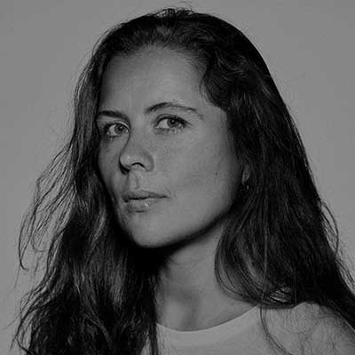
Anna Kulachek

Typography as Image

This talk explores how images often dictate typographic decisions. Anna will share how I work with letterforms as shapes – playing with scale, rhythm, and composition – and how visual forms guide my typographic solutions, making type an extension of the image itself.

About Anna Kulachek
Anna Kulachek

Anna Kulachek is a graphic designer and art director born in Donetsk, Ukraine, and based in New York for the past decade. She has collaborated with leading cultural and fashion institutions including MoMA, MoMA PS1, Nike, Apple, Triennale di Milano, Swarovski, Prada, and Calvin Klein.

Her most significant role was serving as Art Director at Strelka for eight years, working across the institute, publishing house, and bar.

In addition to commercial and cultural collaborations, Anna creates fashion pieces, prints, and screenprints as part of her ongoing personal practice.

k-u-l-a-c-h-e-k.tumblr.com
@kulachek

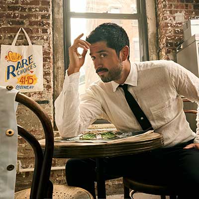
Abraham Lule

Make Quality Tangible

In a world that lives absorbed with what’s on screen, here’s the perspective of a designer who gets his hands dirty (mostly daily) to get the work done. Presenting the cultural impact of environmental graphics and the design principles of regional sign-painting.

About Abraham Lule
Abraham Lule

Sign-Painting Letterer and Designer, Abraham Lule, has carved out a distinctive niche with his flamboyant yet purposeful typography. Abraham’s work stands out for its “purposeful imperfections,” which infuse each piece with a crafted flair that resists the ever-growing digital trends and the test of time. His recognitions are evidence of Abraham’s multi-disciplinary toolkit, including awards in packaging, typography, branding, lettering, and dance. He’s a highly decorated TDC member, a two-time Pentawards winner, and a judge of multiple Design competitions throughout his career. Clients include The New York Times, The New Yorker, Texas Monthly, Pepsi, Disney, Meta, Amazon, and many boutique distilleries and brands in the hospitality industry around the world. In 2026, he started a new project, Article of Kind, an independent design studio with a cinematic point of view specializing in packaging and branding.

abrahamlule.com
@abrahamlule

Berton Hasebe

Finish

In 2015 Berton drew an interpretation of Times with a soft finish. Over the years, the sketch slowly developed into a series of explorations across multiple typefaces. This talk is about how a single idea, with the right context, can be repeatedly revisited and iterated on.

About Berton Hasebe
Berton Hasebe

Berton Hasebe is a type designer based in Honolulu, HI. Together with Hyo Kwon, he runs the type foundry HB Type.

Berton previously worked at Commercial Type, where he released typefaces including Druk, Platform, Portrait, Review and Styrene. His typeface Alda was published through Emigre. Berton has designed custom typefaces for clients such as the Carnegie Museum of Art, Chobani, and MoMA PS1. With Commercial Type, he also drew custom typefaces for clients like Bloomberg Businessweek, Calvin Klein, and T: the New York Times Style Magazine.

Berton received an MA in Type Design from the Type and Media program at the Royal Academy of Art in The Hague (KABK) and a BFA in Graphic Design from Otis College of Art and Design. His work has been recognized by the Art Directors Club, ATypI, BRNO Biennale, D&AD, Print magazine’s “20 under 30”, Type Directors Club, and Tokyo Type Directors Club.

hbtype.com
@hbtype

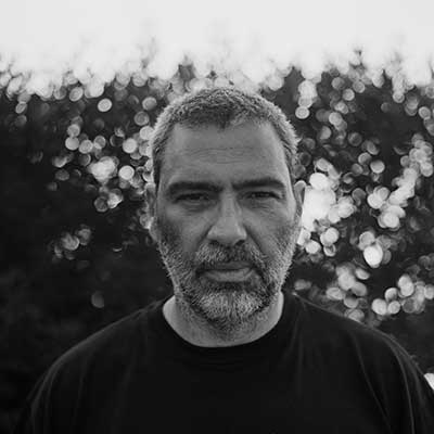
Vasilis
Marmatakis

Filmworks

The talk will showcase the creative process behind the design of a series of posters and titles for Yorgos Lanthimos’s films, including The Lobster, The Favourite, and Bugonia.

About Vasilis Marmatakis
Vasilis Marmatakis

Vasilis Marmatakis studied Graphic Design at Camberwell College of Art, MA Graphic Design at The Royal College of Art in London, and has been a researcher at the Jan van Eyck Academie in Maastricht. He worked in advertising as an art director and in 2003 he co-set up the design studio MNP, working across various media for a diverse range of projects including print, film, exhibition design and web. Since 2009, he has worked freelance and as a visiting lecturer at the Vakalo College of Art and Design in Athens. He has designed the main posters and film titles for several Yorgos Lanthimos films, among others. His work has won numerous awards in Greece and abroad, and he has been invited to collaborate, lecture, and exhibit his work internationally.

marmatakis.net

Emily Oberman

Almost live from New York

Designing the titles for an iconic sketch comedy show is a tiny bit like being on the show itself: an adrenaline-fueled rush filled with moments of joy and panic, planning and improvising, problems and solutions. This talk will be a look at what goes into the challenge of making something new yet familiar for an ever-evolving audience.

About Emily Oberman
Emily Oberman

Emily Oberman is a graphic designer whose work has shaped some of the world’s most recognizable brands across entertainment, culture, and commerce. Her practice spans visual identity, motion graphics, brand strategy, naming, packaging, editorial, and advertising, and is grounded in a belief in the power of language, humor, and emotional connection.

Perhaps best known for her work in entertainment, Emily has designed the title sequences for Saturday Night Live for the past 27 years. Her collaborations include NBC, Warner Bros., Warner Music Group, DC, American Girl, and Coqodaq, contributing to cultural touchstones such as The Tonight Show, Film Independent Spirit Awards, TriBeca Film Festival, and Las Culturistas Culture Awards.

Before joining Pentagram in 2012, Emily co-founded the design studio Number Seventeen and began her career at M&Co. working with Tibor Kalman. She received the AIGA Medal in 2022 and has taught at Yale School of Art, Cooper Union, Parsons, and the School of Visual Arts.

pentagram.com
@emilyoberman

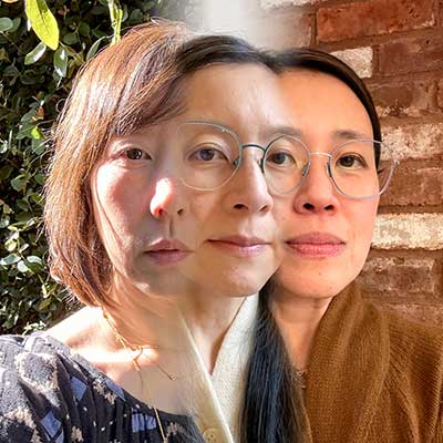
Omnivore, Inc.

Spell Check

The magic of working alone together

About Omnivore, Inc.
Omnivore, Inc.

We are a 3-person, female-owned, graphic design studio located in Brooklyn, New York; Portland, Oregon; and Los Angeles, California. We are first generation Asian-Americans, working mothers, design educators, small business owners, food lovers, justice seekers and friends. We have been collaborating since 2002 and often think of ourselves as a 3-headed monster.

omnivorous.org
@omnivoreland

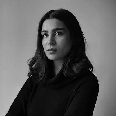
Khyati Trehan

Designing the Doing

No process is ever linear, yet we often set out with the hope of a frictionless path from brief to final. But the longer you linger in ambiguity, the more you’re likely to stumble upon. In this talk, Khyati Trehan makes an argument for creative detours. She advocates for experimentation: the practice of choosing tools not for their speed but for their novelty, for misusing software, creating your own, and mining forgotten work for future gold.

Real-world projects rarely afford the luxury of wandering without a goal for a long stretch, which is why she carves out time to deliberately get a little … lost. It’s how she discovers what she’s capable of.

About Khyati Trehan
Khyati Trehan

Khyati Trehan is an Indian graphic designer and visual artist based in Brooklyn, New York. At Google Creative Lab, she develops visual systems and experimental tools, while parallelly dedicating time to her personal art practice and tinkering with early stage technology. She was previously a senior communication designer at IDEO. Khyati draws inspiration from each project’s context to create visual work for clients like Oscars, The New York Times, Apple, Instagram, WIRED, Vogue, and The New Yorker. Her design work has earned her several honors, including a spot on the Forbes India’s ‘30 Under 30’ list, ADC Young Guns 19, Artistry Creator of the Year awarded by Adweek and Print magazine’s ‘15 New Visual Artists Under 30.’

khyatitrehan.com
@khyatitrehan

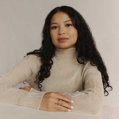
Tida Tep

Mother Tongue: Confronting Identity through Type

As a designer and educator, Tida Tep has spent her career practicing the nuances of typography. However, when she was commissioned to design for a Cambodian documentary and then a Cambodian restaurant, she was forced to confront a personal gap: she couldn't read or write the script of her own heritage.

These projects became an intersection of her American and Cambodian identities, requiring her to formally learn Khmer and its typographic principles for the first time. In this talk, Tida reflects on the complex mix of shame and pride that accompanied this learning process. She discusses how these design briefs provided a necessary space for reflection and reshaped her understanding of her work and Cambodian-American identity.

About Tida Tep
Tida Tep

Tida Tep is a Cambodian-American designer based in Brooklyn. She has worked with a range of clients including Apple, The New York Times, MoMA, Uniqlo, LVMH, and Google Creative Lab. Beyond her commercial work, Tida serves as the Executive Creative Director of Tidal magazine, an independent fashion and pop culture magazine, and teaches typography at The Cooper Union. She holds a BFA in Graphic Design from Virginia Commonwealth University and a Postgraduate Certificate in Typeface Design from Type@Cooper.

tidatep.com
@tidatep

Nekisha Durrett

Counter Spaces: The Shape of Memory and Absence

Nekisha Durrett employs public art and social practice to explore how typography, monument, and place create encounters with histories often left unseen. Through deep research and material investigation, she traces the presence of the past in the present, surfacing stories that are often overlooked or uncelebrated.

About Nekisha Durrett
Nekisha Durrett

Nekisha Durrett is a Washington, DC-based artist whose work brings hidden and overlooked histories into public view. Grounded in deep research and material exploration, her multidisciplinary practice spans public art, installation, sculpture, painting, and social practice. Durrett is especially drawn to stories of Black life, labor, and imagination that have been forgotten or intentionally erased, creating spaces that hold both remembrance and possibility.

Her work often begins with fragments – an archival image, a personal story, a neglected site – and evolves into layered forms that invite reflection, ritual, and collective memory. Through site-specific installations and collaborative processes, Durrett makes room for voices long silenced and for futures not yet written.

Durrett’s permanent public artworks are found at Arlington Arts in Virginia, the Baltimore Museum of Art, Miami Dade County, the Phillips Collection and MLK Jr. Memorial Library in Washington, DC, the City of West Palm Beach, and Bryn Mawr College in Pennsylvania. In 2026, her large-scale, community-driven commission Hem of Heaven will be unveiled at the Obama Presidential Center in Chicago. She holds a BFA from The Cooper Union for the Advancement of Science and Art and an MFA from the University of Michigan Stamps School of Art and Design.

nekishadurrett.com
@nekishadurrett

Cristian Vargas

Lettershaping Emotion

The most influential aspects of a creative practice are often the least visible. The intangible and silent processes loudly shape decisions, directions, and outcomes. This talk examines how type design can carry emotion through form. In my approach, intuition leads and structure follows; typefaces become vessels of accumulated experience. I will share how letterforms emerge from abstract sources such as personal drawings, memories, and observation.

Influenced by graffiti, natural forms, and collected visual references, my work develops through the translation of impressions into larger systems. Typography, in this sense, operates as both image and language, allowing us to read meaning while decoding the emotion embedded in form.

About Cristian Vargas
Cristian Vargas

Cristian Vargas is a Creative Director and type designer based in New York City. He is the founder of Typozon, a brand identity studio and type foundry working across brand creation and original type design. His practice explores the tension between structure and expression, where typography functions as both system and voice.

He has led design initiatives for global brands including Netflix and Apple, as well as companies across technology and consumer goods. His work has been featured in publications including Taschen, Novum, AIGA Eye on Design, Typographica, and PAGE, and in books such as L’agenda Perpetua and The World’s Best Typography. His typefaces have received recognition from the Type Directors Club.

Vargas has served as a juror for the Latin American Design Awards and has lectured at the School of Visual Arts, The New School, and SCAD. He holds an MA in Type and Media from the Royal Academy of Art (KABK) in The Hague.

typozon.xyz
@Typozon@typo.social
@typozon.xyz

Bijan Berahimi

Type Identity

A talk about the relationship between musicians and typography, and how artists use type across album campaigns to express who they are at a specific moment in time. Drawing from my experience working on music projects, I’ll look at how fonts become tied to different eras in an artist’s career, signaling shifts in identity, sound, and perception, while contributing to a larger legacy. Even though album campaigns are temporary, the typography often sticks, shaping how those moments are remembered.

About Bijan Berahimi
Bijan Berahimi

Bijan Berahimi is an Iranian-American graphic designer, curator, and the founder of FISK, a multi-faceted creative practice based in Portland, Oregon. He graduated with a BFA in graphic design from the California Institute of the Arts (CalArts) in 2013.

With an emphasis on typography, image making, and design systems, Berahimi has developed identities and campaigns for the world’s leading brands and musicians. His clients include Nike, A24, Clairo, Toro y Moi, Rolling Stone, Aminé, Paramore, and Molly Baz.

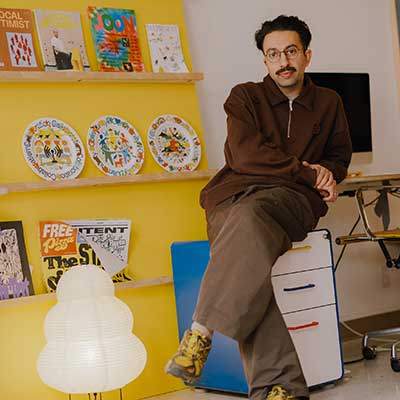
In addition, his curatorial practice with FISK Gallery has brought over 30 solo shows to Portland, inviting renowned artists and designers from all over the world to showcase their work. Berahimi’s practice champions diverse, creative voices, inspiring a greater connection with local and global design communities.

Berahimi’s accomplishments include being the first designer-in-residence at the Facebook Analog Research lab in 2016. He is also the founder and publisher of JOON magazine, a publication that highlights the arts and culture scene in Portland.

fiskprojects.com
@bijanberahimi

Richard Turley

Civilization

A short, concise talk about the making of Civilization, Turley's New York broadsheet newspaper. About what it's like to work with type as your only tool, how overwhelm becomes a design decision, and how you hold a grid in your head while throwing it out on the page. He'll talk about iteration, collisions, about a personal project that grew into a network of collaborators and eventually attracted commercial attention. About Times New Roman, agate settings, default typography, a decades long working relationship with Commercial Type. It will be honest, practical, and chaotic — like the paper itself.

About Richard Turley
Richard Turley

Richard Turley (b. UK 1976) is an English graphic designer and creative director whose irreverent, boundary-pushing work has made him one of the most influential figures in contemporary print and visual culture.

He studied graphic design at Liverpool Art School, and after graduating joined The Guardian, where he worked his way up to art directing the daily G2 section. In 2010, he moved to New York to lead Bloomberg Businessweek, transforming it into a publication full of experimental, avant-garde graphic storytelling – earning praise from design legend George Lois, who called its covers “the best consistent set of covers in 40 years.”

In 2014 he joined MTV, then moved to Wieden+Kennedy in 2016 as global executive creative director, working on campaigns for Nike, Formula One, and others. He was editorial director of Interview magazine and is co-founder of Civilization and Nuts.

Turley has forged a unique place in the history of print design, making work that feels theoretically alive – not just visually innovative.
“One of great graphic designers in history” Sex Magazine
“Design anti-hero” Dazed & Confused

richardturley.tumblr.com

Kelli Anderson

Conveying a Millenia of Typographic Ideas Through PLAY

If you’ve ever taken an art history class or embarked on an architectural history tour, you have sleuthed to find philosophy embedded in brushstrokes and laid in brick. What we talk about less is that type, too, contains the history of the world’s ideas in its microcosm.

With a surprising economy of expression, letterforms connect us to an aesthetic and emotional experience of ever-evolving cultural history. On every sanitation building and post office, in every Microsoft Word or Google document, and in every discarded-electronics bin, you will find letters embedded with different ideas about what language (and by extension, civilization) is for. By following the line of the flat brush, the chisel, the pen nib, or the Bézier handle, we can use our eyes to begin to take apart aspects of our world that seem immutable.

This past year, I made a book that helps people tinker with this history: to warp typographic shadows in a paper phototypesetter, to puzzle-together Josef Albers’ modular alphabet, and to rearrange grayscale antialiasing fuzz. When we can touch grass—and our senses and minds can work in tandem—we gain the agency to sink more deeply into histories that may otherwise seem impenetrable.

About Kelli Anderson
Kelli Anderson

Kelli Anderson uses handheld revelations to reconnect people with the depth and possibility of their world. Her books force readers to touch grass paper. She created This Book is a Camera (MoMA) – which transforms into a working camera – and This Book is a Planetarium (Chronicle) – which houses paper devices (including a planetarium) and has sold more than 100,000 copies. Alphabet in Motion, an interactive book about typography and technology was published to wide acclaim in the Fall of 2025. The Washington Post book editor writes that “the work of literature that delighted me most this year is this pop-up book.” Other projects include a viral paper record player and – with The Yes Men – a utopian counterfeited New York Times, which won the Ars Electronica Prix. Doctors without Borders have used the award-winning Tinybop Human Body app she illustrated to communicate illness and treatment nonverbally to their patients in remote areas. Clients include NPR, The New Yorker, the Guggenheim, MoMA, Apple, and the New York Times. She has been nominated for the Cooper-Hewitt Smithsonian National Design Award twice and teaches at NYU, SVA, and Cooper Union.

kellianderson.com
@kellianderson

Tal Midyan

Authorship over aesthetic

When ideas dictate form; designing for music without a fixed visual language.

About Tal Midyan
Tal Midyann

Tal Midyan is a New York-based creative director and graphic designer who has made a career of crafting and leading projects that shape the identity of renowned music artists and brands. Midyan’s practice is rooted in a critical graphic design education with a strong interest in the intersection of technology and contemporary culture. Since founding his studio, Midyan has collaborated with artists including Travis Scott, Lady Gaga, The Weeknd, Deftones, and Eartheater, as well as with brands and institutions such as Apple, Dior, Supreme, and the Venice Biennale of Architecture. Midyan’s work has been recognized by major design awards, including D&AD, The One Club, Cannes Lions, and the Webby Awards.

otm.work
@talmidy

Register

Registration for the main Typographics 2026 confer­ence is now open, with discounts available for students, educators, and group ticket bundles.

Conference regstration is separate from the Workshops & Tours and TypeLab. You must register for those events separately.

Conference Pricing

Student
$295*
For full-time matriculated students currently enrolled in college. Please be prepared to show valid student ID card at check in.
Educator
$485*
For college staff, instructors, adjuncts, professors, and public library librarians.
Professional
$550*
Standard tickets for professional attendees.
Small bundle
$495/ticket*
For 5–9 professional tickets. These tickets are non-refundable but may be transferred to another person if requested before May 30, 2026.
Large bundle
$470/ticket*
For 10 or more professional tickets. These tickets are non-refundable but may be transferred to another person if requested before May 30, 2026.
Livestream tickets
$0–100*
These “Pay What You Can” tickets provide access only to the online livestream for the conference and support our efforts to make events accessible remotely.

* Prices shown here do not include Eventbrite processing fees, which are non-refundable.

Get conference tickets ➡︎

Please note: Typographics participants are subject to our Code of Conduct & Policies. If you do not agree to these conditions, do not register or attend any Typographics events.

Stay Updated

More info about this year’s Typographics will be announced in the coming weeks.

Join the mailing list to get the latest news and announcements:

Also follow Typographics on Mastodon and Instagram.

Sponsors

We’re grateful to have the support of some of our favorite organi­zations. Without their generosity, Typo­graphics would not be possible.

Interested in sponsoring? Write to type@cooper.edu

Presenting Partners

The Cooper Union Type@Cooper The Herb Lubalin Study Center
NYS Council on the Arts

Typographics is made possible by the New York State Council on the Arts with the support of the Office of the Governor and the New York State Legislature.

Silver Sponsors

Frere-Jones Type Commercial Type Google Fonts Pentagram Business Letters

Lead Sponsors

Klim Type Foundry Adobe Dual Type HEX Projects Contrast Foundry Monotype Glyphs Maryland Institute College of Art

Brass Sponsors

Font of the Month Club OH no Type Co. Production Type Morisawa Fontdue The Type Founders Blaze Type R-Typography ReadymagThe Metropolitan Museum of Art

Pixel Sponsors

XYZ Type CJ Type MCKL Type Emtype Signal Type Foundry Kerns & Cairns Darden Studio Arrow Type Mass-Driver Type Syndicate munchfonts Schrifteria Foundry 5 Binnenland Typefaces Mostardesign Monotype Foundry Program Hoffmitz Milken Center for Typography Tee Vision Printing Society of Scribes

Association & Media Partners

Fonts In Use Typotheque Type Directors Club AIGA NY

Interested in sponsoring? Write to type@cooper.edu